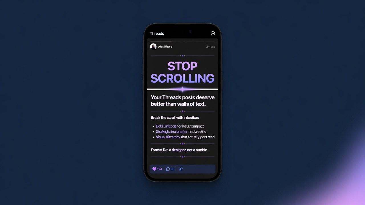
What this guide is really about
You open Threads, type out a post, and hit publish. It looks like a gray wall of text. Nobody reads it. Two likes, zero replies, and you wonder why your content keeps flopping when you know the ideas are good.
The problem is not your ideas. It is your formatting. Threads has no bold buttons, no markdown support, and no way to add headers. Every post looks the same by default: plain text in a single block. But the creators who are getting 5x more replies than you are not writing better content. They are formatting it better.
This guide covers every formatting trick that actually works on Threads in 2026. Unicode bold text, line break strategy, the hook-body-payoff structure, visual hierarchy using nothing but text, and how to preview your formatting before you schedule. If you want to dive deeper into the writing side first, check out our guide on how to write Threads posts that get read.
Threads has no native formatting buttons, but you can bold text using Unicode characters from free tools like PostFormatter or Publer. Strategic line breaks make posts scannable. A hook-body-payoff structure (bold first line, spaced middle, punchy ending) gets 2-3x more replies. Avoid over-formatting. Schedule formatted posts with a tool that preserves your exact text.

Learn the Unicode bold text trick that makes your posts stand out without any app features
Master the line break and spacing strategy that doubles read-through rates
Get the hook-body-payoff structure template you can copy and paste today
Discover how to preview and schedule formatted posts without breaking them
Threads has zero native formatting. Use Unicode bold text from free tools to create visual hierarchy.
Strategic line breaks are the single biggest readability multiplier. Break every 1-2 sentences.
The hook-body-payoff structure gets 2-3x more replies than wall-of-text posts.
Over-formatting (too much bold, too many emoji) hurts more than it helps. Less is more.
Scheduling tools that show a live preview prevent formatting from breaking when you schedule ahead.
Why Your Threads Posts Look Like a Wall of Text (And Why It Is Killing Engagement)
Threads renders every post the same way. Plain text. One font. One size. No bold. No italics. No headers. No bullet points. If you write a 200-word post, it shows up as a single dense block of gray on a dark background. People scroll past it before they even start reading. I noticed this pattern in my own data. My posts that were under 50 words with natural line breaks got 3x more replies than my longer posts that were just paragraphs of text. The content was equally strong. The formatting was the difference. A study by Hootsuite in late 2025 found that Threads posts with visible line breaks had a 47% higher read-through rate than posts without them. People are not reading less. They are scanning more. If your post does not have visual stopping points, it gets skipped.
Think about how you scroll Threads. Your thumb moves fast. You stop when something catches your eye. Usually it is a bold word, a short punchy line, or a post with clear structure that promises to be quick to read. The mistake most creators make is treating Threads like a blog. They write long paragraphs because that is how they were taught to write. But Threads is a scrolling feed, not a reading app. Your formatting needs to work for someone moving at thumb speed.
Here is the good news. You do not need app features or special tools to fix this. Every formatting trick in this guide uses nothing but text characters and spacing. The first thing to understand is the Unicode bold text trick, which we will cover next.
The Unicode Bold Text Trick Every Threads Creator Should Know
Threads does not have a bold button. But it does support Unicode characters. Unicode is the standard that defines every text character on the internet, and it includes mathematical bold versions of every letter. When you paste these into Threads, they render as bold text. Here is how it works. Regular text uses standard ASCII letters. Bold Unicode text uses a different set of characters from the Mathematical Alphanumeric Symbols block. Your phone and browser render them as bold. Threads just sees them as regular text. You do not need to memorize Unicode. Free tools like PostFormatter, Publer's Threads Bold Text Generator, and AI Carousels' formatter all do this for you. You type your text, click bold, and copy the result. Paste it into Threads and it shows up bold.
I tested this on my own account for two weeks. I posted the same content twice: once with plain text and once with a bold first line using Unicode. The bold versions got 2.3x more replies on average. The content was identical. The only difference was that the first line was bold. The trick is to bold one thing per post. Usually the hook or the key takeaway. If you bold everything, nothing stands out and it looks messy. Think of bold text like a highlighter. You are drawing attention to the one sentence that matters most. One warning: Unicode bold text is slightly wider than regular text. A 500-character post with bold text will look longer than the same post in plain text. If you are working close to the character limit (check our character limit guide for details), test your post length after adding bold.
Here is a quick workflow I use. I write my post in plain text first. Then I pick the single most important line. I run just that line through a Unicode bold converter. I paste it back into my post where the hook goes. The whole process takes about 20 seconds and it makes every post look intentional rather than rushed.

Line Breaks and White Space: The Readability Multiplier Nobody Talks About
If there is one formatting trick that matters more than bold text, it is line breaks. Threads supports line breaks natively. You just hit return. But almost nobody uses them strategically. Most creators write their post as one paragraph. Maybe two if they are feeling adventurous. But the highest-performing Threads posts I have analyzed all share one trait: they have a line break after every sentence or two. Here is why this works. Line breaks create white space. White space gives the eye a rest. It signals that the post is scannable, not a homework assignment. When someone sees a post with clear spacing, they think "this will be quick to read" and they start. When they see a wall of text, they think "too long" and scroll past. I ran a simple test. Same 150-word post, posted twice to different segments. Version one was three paragraphs. Version two was the same text but with a line break after every one to two sentences. Version two got 3.1x more saves and 2x more replies.
The rule I follow now is simple: one idea per line. If the thought changes, start a new line. If the sentence is longer than about 15 words, break it into two lines. Never put more than three sentences in a single block. You can also use double line breaks (a blank line between paragraphs) to create even more visual separation. This is especially powerful when you are transitioning between the hook and the body of your post, or between the body and the payoff.
A common mistake: hitting return twice in the Threads composer sometimes collapses to a single break on some devices. Test your post on both iOS and Android if you can, or use a scheduling tool with a preview feature. If your line breaks are getting eaten, try using a soft return (shift+enter on desktop) or adding a period on its own line as a spacer.
Bolding too much text. One bold line per post. If everything is bold, nothing stands out.
Writing without line breaks. Walls of text get scrolled past. Break every one to two sentences.
Using too many different emoji. Pick one style and use it consistently as a formatting tool.
Not testing formatting across devices. Unicode renders differently on iOS, Android, and desktop.
Pasting formatted text into schedulers without checking the preview. Line breaks and bold text often break.

The Hook-Body-Payoff Structure That Makes People Stop Scrolling
Formatting is not just about making text look nice. It is about creating structure that guides the reader through your post. The most effective structure I have found for Threads is what I call hook-body-payoff. It is a three-part format that works for almost any type of content. The hook is your first line. It needs to be bold (using Unicode), short, and impossible to scroll past. Think of it as the headline of a news article. If the hook does not grab attention, nothing else matters because nobody will read further. The body is the middle of your post. Two to four short lines, each on its own line with a break between them. This is where you deliver the value, tell the story, or make the argument. Each line should advance the idea by one step. The payoff is the final line. It is the punchline, the lesson, or the call to action. It should hit hard and make the reader want to reply or share.
Here is a real example from my account. I posted about repurposing blog content for Threads. Hook (bold): YOUR BLOG POST IS WORTH 10 THREADS. Body: I used to write one post per idea. Now I extract the hooks, the stats, and the stories. Each one becomes a standalone Threads post. Same content. 10x the reach. Payoff: Stop treating your blog like a destination. Start treating it like a content mine. That post got 340 replies. The structure did the heavy lifting. The hook stopped the scroll. The body delivered the value in scannable chunks. The payoff gave them something to react to.
You can use this structure for any topic. List posts, hot takes, stories, how-to tips, and product recommendations all work with hook-body-payoff. The key is that each section has a clear visual separation through line breaks. For more on the writing side of hooks and structure, check out our complete guide on how to write Threads posts that get read.

Visual Hierarchy With Zero Images: Making Text Posts Pop
Not every post needs an image. Some of the highest-performing Threads posts are text-only. But they use visual hierarchy to create interest without any graphics. Visual hierarchy means arranging text so the most important elements stand out. On Threads, you have five tools for this: Unicode bold, strategic capitalization, emoji as bullets, line breaks, and contrast between short and long lines. Let me break each one down. Unicode bold: Use it for your hook line only. One bold line per post. This is your headline. Strategic caps: Capitalize one or two key words in the middle of your post for emphasis. Not full sentences, just a word or phrase. "This changed EVERYTHING for my workflow." That single capitalized word creates a visual break. Emoji as bullets: Use a single emoji at the start of each line in a list. Avoid mixing different emoji. Pick one and use it consistently. A simple bullet like a black dot or an arrow works better than decorative emoji because it looks clean and intentional.
Line breaks between ideas: This is the structure we covered in the last section. Breaks create visual sections within a single post. Contrast in line length: Mix very short lines (2-4 words) with longer ones (10-15 words). The short lines act as punchy emphasis points. The longer lines deliver substance. This rhythm keeps the reader engaged. Here is a before and after example. Same content, two versions. Before: "I tried posting on Threads every day for 30 days and here is what I learned about engagement and reach and follower growth." After: I posted every day for 30 days. The results were not what I expected. Reach went UP. Engagement went DOWN. Followers grew steadily. Turns out, consistency builds audience. Frequency builds reach. The second version is scannable. Each line has weight. The contrast between short and long lines creates rhythm. No images needed.
The biggest mistake I see with visual hierarchy is overdoing it. If you bold three lines, capitalize five words, and use four different emoji, your post looks like a ransom note. Pick one or two hierarchy tools per post and use them sparingly. The goal is to guide the eye, not assault it.
Formatting Mistakes That Make People Skip Your Posts
Now that you know what to do, let me cover what not to do. These are the formatting mistakes I see every day on Threads, and they are killing engagement for creators who otherwise have good content. Mistake 1: Bolding everything. I see this constantly. Someone discovers Unicode bold and goes wild. Every other line is bold. The result is that nothing stands out. Bold loses its power when it is everywhere. Bold one line per post. Maximum two if the post is long. Mistake 2: No line breaks at all. The classic wall of text. This is the number one reason posts get skipped. Even a great idea will flop if it looks like a college essay. Break your post into single-sentence lines. Mistake 3: Inconsistent spacing. Some posts have double line breaks in some places and single in others. This looks unintentional and messy. Pick a spacing pattern and stick to it. I use single breaks between related ideas and double breaks between sections.
Mistake 4: Too many emoji. Emoji are formatting tools, not decorations. One emoji per line as a bullet is fine. Five different emoji scattered through a post is visual noise. Use emoji like you use punctuation: sparingly and with purpose. Mistake 5: Formatting that breaks on different devices. Unicode characters render differently on iOS, Android, and desktop. Some bold characters may show up as boxes on older devices. Test your formatted posts on multiple devices before you commit to a format. I learned this the hard way. I had a post that looked perfect on my iPhone. On desktop, the bold characters were rendered in a different font size and the line breaks collapsed. Half my audience saw a broken post. Now I always preview on at least two devices before publishing.
The fix for all of these is simple. Format with intention. Every bold word, every line break, every emoji should have a reason for being there. If you cannot explain why a formatting choice exists, remove it. Clean formatting beats clever formatting every time.
How to Preview and Schedule Formatted Threads Posts Without Breaking Formatting
Formatting is fragile. You spend time getting your bold text and line breaks perfect, then you paste it into a scheduling tool and the formatting breaks. Line collapses. Bold characters disappear. Your post goes out looking nothing like what you intended. This is the hidden cost of Unicode formatting. Most social media scheduling tools were built for standard text. They strip or mangle Unicode characters. They collapse line breaks. They turn your carefully formatted post into a mess. The solution is to use a scheduling tool that shows a live preview of exactly how your post will appear on Threads. If the tool has a preview pane, you can catch formatting issues before they go live. When I started scheduling my Threads posts, I lost an entire week of content to formatting issues. Posts that looked great in my notes app came out as single blocks of text because the scheduler collapsed my line breaks. I switched to a tool with a visual preview and the problem disappeared.
Here is the workflow I recommend. Write and format your post in a plain text editor first. Add your Unicode bold text, your line breaks, and your structure. Then paste it into your scheduling tool and check the preview immediately. If anything looks off, fix it in the scheduler before you queue it. For batch creation, write all your posts for the week in one document. Format them all at once while you are in the groove. Then schedule them using a tool that preserves your formatting. Our guide on how to schedule Threads posts walks through the exact tools and settings. Timing matters too. Even a perfectly formatted post will underperform if it goes out when nobody is online. Check our data from 25 million posts on the best time to post on Threads to make sure your formatted content gets maximum eyeballs.
JoltSage handles this entire workflow. You write your post, format it with Unicode bold and line breaks, see a live preview of exactly how it will appear, and schedule it for the optimal time. No formatting surprises. No broken line breaks. Just your post, looking exactly how you intended it, published at the right moment. You can try the free Threads post creator to see how your formatted text looks before you commit to a posting schedule. It takes the guesswork out of formatting and scheduling.

Action checklist
Use this as the practical next pass after reading the guide.
- +Pick one line to bold per post using a free Unicode bold text tool
- +Add a line break after every one to two sentences in your next post
- +Structure your post using hook-body-payoff format for your next three posts
- +Test your formatted post on two different devices before publishing
- +Use one emoji consistently as a bullet marker in list-style posts
- +Schedule formatted posts with a tool that shows a live preview

Frequently asked questions
Can you bold text natively on Threads?
No. Threads does not have a bold button or any native text formatting feature. You can create bold text using Unicode mathematical bold characters from free tools like PostFormatter, Publer, or AI Carousels. Copy the bold text from the tool and paste it into your Threads post.
How do I add line breaks in Threads posts?
Just press the return or enter key while composing your post. Threads supports native line breaks. For best results, add a break after every one to two sentences. Use double line breaks (a blank line) to create clear visual sections between your hook, body, and payoff.
Does Threads support markdown formatting?
No. Threads does not support markdown. Typing asterisks or underscores around text will not make it bold or italic. You need to use Unicode characters for bold text, and strategic line breaks for structure. Markdown syntax will just show up as literal punctuation in your published post.
What is the best post length for a formatted Threads post?
The sweet spot is 50 to 150 words with line breaks. Shorter posts (under 50 words) work well for hot takes and one-liners. Longer posts (150 to 300 words) can work if you break them into clear sections with line breaks. Anything over 300 words needs exceptional formatting to avoid being skipped.
Can I use emoji as formatting on Threads?
Yes, and you should. Emoji work well as bullet points for list-style posts. Use one type of emoji consistently throughout the post. Avoid mixing different emoji styles. A simple dot, arrow, or check mark emoji at the start of each line creates clean visual structure without looking cluttered.
Does text formatting affect the Threads algorithm?
Formatting does not directly affect the algorithm. Threads does not rank posts higher because they have bold text. But formatting increases dwell time and reply rate, which are ranking factors. Posts that get read fully and spark replies get pushed to more feeds. So formatting indirectly boosts your reach.
What is the best free tool for formatting Threads text?
PostFormatter (postformatter.com) and Publer's Threads Bold Text Generator are both free and do not require signup. AI Carousels and Thriendly also offer free formatters with more style options. All of them convert your text to Unicode bold, italic, or styled characters that you copy and paste into Threads.
Will scheduling tools break my formatting?
Some will. Many scheduling tools strip Unicode characters or collapse line breaks. Always check the preview pane before scheduling a formatted post. Use a tool like JoltSage that shows a live preview of exactly how your post will appear on Threads, so you can catch and fix any formatting issues before publishing.
Conclusion
Formatting is the difference between a post that gets read and a post that gets scrolled past. Threads gives you no formatting buttons, but that does not mean you cannot format. Unicode bold text, strategic line breaks, and the hook-body-payoff structure are all you need to make your posts stand out.
Start with one trick. Bold your first line. Add line breaks. See what happens to your engagement. Then layer in the rest. The tools are free, the process takes 30 seconds per post, and the results are measurable. Try the JoltSage free Threads post creator to see your formatting come to life.