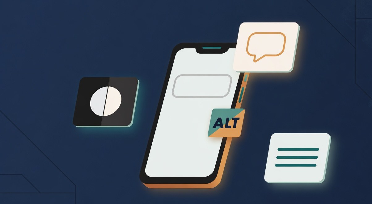
What this guide is really about
Accessibility has a perception problem on social media. Mention it in a room of creators and people picture legal compliance teams, WCAG audit documents, and government websites. The practical reality is smaller and more useful: some of your readers cannot see your images, hear your videos, or parse a wall of tiny text on a busy graphic. A few habits close most of that gap.
This guide is written for people who publish daily, not for institutions writing policy. Every recommendation here fits into a normal posting workflow: writing alt text in seconds, captioning video without special software, checking contrast before export, and running a 60-second check before you hit post. No audits, no certifications, no jargon walls.
Accessible social media means your posts work for people who cannot see images, hear audio, or read low-contrast text. Write custom alt text, caption every video, keep graphic text at 4.5:1 contrast or higher, camel-case hashtags, limit emoji, and never rely on emoji alone for meaning. On most apps these live under accessibility on the post screen. The full check takes about a minute once it is routine.
Custom alt text beats auto-generated descriptions on every major platform; write what the image shows, not what it means to you
Every video needs captions, and auto-captions need a correction pass for names, jargon, and punctuation
Text baked into graphics needs 4.5:1 contrast for normal-size text; if you cannot read it squinting, a screen cannot parse it either
Camel-case hashtags (#SocialMediaTips not #socialmediatips) make them readable by screen readers
Accessibility is a pre-publish habit, not a policy document; a 60-second check covers most of it
Why Accessibility Belongs in a Creator Workflow
The World Wide Web Consortium publishes the Web Content Accessibility Guidelines, the standard most accessibility checklists descend from. The criteria that matter for social posts are concrete: text alternatives for images (1.1.1), captions for prerecorded video (1.2.2), sufficient color contrast (1.4.3), and nothing that flashes more than three times per second (2.3.1). Four rules cover almost every post a creator makes.
The audience is bigger than most creators assume, and it is not only people with permanent disabilities. Anyone scrolling one-handed on a busy train is watching your video on mute. Anyone with a slow connection sees your alt text before your image loads. Anyone with color vision deficiency sees your grey-on-grey quote graphic as a blur. Accessible posts reach more people in more contexts, which is the same goal as every other publishing habit you keep.
There is also a practical production argument. Alt text forces you to decide what the image is actually for. Captions force you to know what your video says. Contrast checks force cleaner design. The discipline that makes posts accessible is the same discipline that makes them clear, which is useful whether or not you are chasing a specific metric.
How to Write Alt Text That Actually Describes
Alt text is a plain-language description of an image, read aloud by screen readers or displayed when images fail to load. The craft rule: describe what is shown, not what it means to you. A screen reader user already knows it is an image; they need the information inside it.
Start with the subject, add the detail that carries meaning, and stop. For a product photo: "A ceramic mug in matte black, handle facing left, on a wooden desk." For a chart, you have license to interpret: "Bar chart showing replies doubled from 40 to 85 across eight weeks." For a quote graphic, the alt text should carry the quote itself, because the text is the content. If the image is purely decorative, most platforms let you mark it decorative or leave alt text empty; that is a valid choice, not a shortcut.
Before and after rewrites show the gap. Before: "image of chart." After: "Line graph of weekly impressions, rising from 2,000 to 9,000 between March and June." Before: "me at the beach." After: "Standing on a rocky beach at sunrise, facing the water." The before versions pass a lazy checklist; the after versions pass information. That difference is the entire skill.
Length guidance is simple: under about 125 characters covers most photos, and complex images like infographics should summarize their key point rather than transcribe every cell. If a graphic contains data people need, put the full data in the caption or a linked post and keep the alt text to the headline finding. The Instagram Help Center documents exactly where to write alt text before posting, under Accessibility on the post screen.
The Platform Matrix: Where Alt Text Lives
Platforms differ in where they hide accessibility settings, and some differ in whether they exist at all. This matrix covers the platforms creators post to most; verify in your own app because interfaces move.
Threads: custom alt text arrived in August 2023, as The Verge reported at the time. After attaching a photo or video, open the More menu at the bottom left of the attachment and choose Add alt text; the official Threads alt text guide on Meta's help center walks through the same steps for desktop and mobile. In account settings, the accessibility section lets you turn on an alt text badge so you can view descriptions on other people's posts. Accessible Social maintains a current step-by-step for Threads and every other major platform.
Instagram: alt text sits under Accessibility on the final post screen, documented in the Instagram Help Center. Facebook: the ALT button appears after the image uploads, on the post composer. LinkedIn: alt text is offered after image upload on the popup screen for the image. X: add description to image appears after attaching, under the image's edit flow. TikTok and YouTube: captions are the primary accessibility surface, and both offer auto-captions with editing.
One structural note for cross-posters: alt text does not always survive the cross-posting pipeline. If you adapt one image across three platforms, as the cross-posting framework we wrote elsewhere describes, check the description field on each target platform rather than assuming the first one carried through.
Trusting auto-generated alt text: auto descriptions identify objects, not meaning. "May be: outdoors, people" tells a screen reader user nothing. Replace, do not accept.
Writing alt text for the algorithm instead of the reader: keyword-stuffed alt text is invisible to human readers and unhelpful to assistive ones. Describe the image; that is the whole job.
Burning captions into video without a correction pass: auto-captions garble names and jargon. A two-minute read-through against the audio catches most errors.
Putting the whole post inside the graphic: if the quote or stat only exists as pixels, it is invisible to screen readers and unquotable to everyone else. Text in the caption, headline on the graphic.
Treating accessibility as a retro-fit: fixing a library of old posts is slow and demoralizing. A per-post check at publish time costs a minute and compounds.
Captions and Video: The Highest-Leverage Fix
If you fix only one thing from this article, fix video captions. Most social video is watched without sound at least part of the time, and deaf and hard-of-hearing viewers need captions for all of it. Auto-captions exist on every major platform now, and they are a reasonable first draft, but they reliably mangle proper nouns, technical jargon, and sentence boundaries.
The professional habit is a correction pass. After auto-captions generate, read them against your audio and fix names, terms, and punctuation. On platforms where you upload your own caption file, the workflow is the same: draft, correct, upload. Burned-in open captions, where the text is part of the video image itself, guarantee display everywhere the video travels.
Two smaller rules complete the video picture. First, do not rely on auto-generated captions alone for content where precision matters: tutorials, pricing, anything with numbers. Second, if your video has important visual-only information, a demo that is never spoken, mention it in the caption or description so viewers who cannot see the screen still get it. Section 508 guidance for federal social media, which is a useful public reference even for private creators, makes the same point about captions and audio descriptions.

Text on Graphics: Contrast and Readability
Quote graphics, stat cards, and cover images are where accessibility most often breaks, because text baked into an image is invisible to screen readers and often unreadable to eyes. Two rules cover nearly all of it: contrast and restraint.
Contrast: WCAG specifies 4.5:1 for normal-size text and 3:1 for large text. In practice, dark text on a light background or the reverse, and be suspicious of pastels, yellow, and low-saturation greys. Every serious design tool has a contrast checker; use one before export, not after publishing. When a graphic fails, the fastest fix is a text scrim, a semi-transparent dark layer behind the text.
Restraint: every word you bake into an image is a word a screen reader user cannot read unless you alt-text it. Keep on-image text to the headline, and put the full quote or data in the caption where it is text-native. This mirrors advice in our guide to formatting Threads posts: structure and whitespace do the reading work, not density. If the graphic carries a real chart, summarize the finding in alt text and link the full numbers in text.
Hashtags, Emoji, and Text Habits
Screen readers read hashtags letter by letter when they are lowercase mush. Camel case, capitalizing each word (#AccessibleSocialMedia), lets the reader parse them as words. It also looks better and is easier for everyone to scan, which is why most style guides recommend it regardless of accessibility.
Emoji: one or two emoji that reinforce tone are fine. A row of ten makes a screen reader announce each one, in order, every time: clapping hands, clapping hands, clapping hands. Put emoji at the end of a line rather than the middle, never use them in place of words, and never let them carry information alone. The same principle applies to symbols like the asterisk dividers and ASCII art borders: decorative repetition that reads as noise.
Formatting text for readability helps everyone: short paragraphs, real line breaks instead of character walls, and descriptive link text rather than bare URLs. The way you format a post is an accessibility decision, because attention differences and cognitive load affect how many people can parse your writing. If a post only makes sense when read perfectly, it excludes more readers than you intend.
The 60-Second Pre-Publish Check
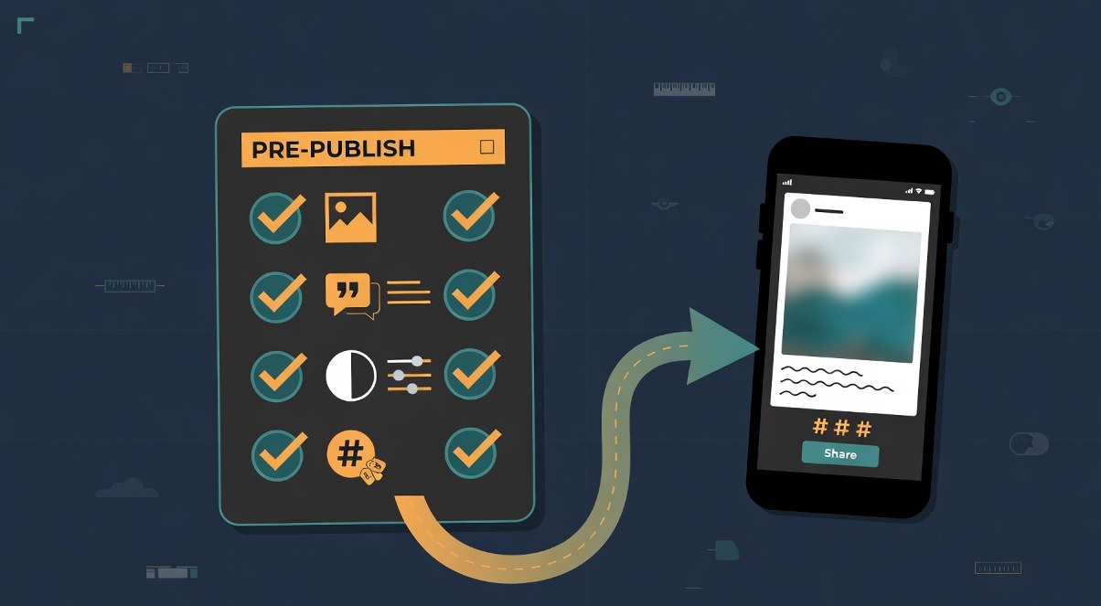
Everything above compresses into a routine you can run per post, in about a minute. This is the checklist format: quick enough to keep, complete enough to matter.
Images: alt text written, describes content not intent, under about 125 characters, decorative images marked. Graphics: on-image text at 4.5:1 contrast or higher, headline only, full text in caption. Video: captions on and corrected, spoken-numbers check done, visual-only info described. Text: hashtags camel case, emoji limited and placed at line ends, line breaks real, links descriptive. Platform: description field filled on each platform you post to, not just the first.
Fold this into whatever production system you already run. If you batch content, the accessibility check belongs in the QA step of the batch, right before scheduling, the same slot our content batching system assigns to final review. If you post live, run the check while the post screen is open; every item is visible on one screen on every major platform. And if you plan posts in advance in a tool like our free Threads post creator, you can draft alt text alongside the caption so it is ready at publish time.
Action checklist
Use this as the practical next pass after reading the guide.
- +Write custom alt text for every image post this week, replacing any auto-generated text
- +Run one correction pass on auto-captions for your next three videos
- +Check contrast on your current quote-graphic template with a contrast checker before reusing it
- +Rewrite your standard hashtag set in camel case
- +Add the 60-second check to your pre-publish or batching QA step
- +Verify the alt-text field on each platform you cross-post to, not just the first
Conclusion
Accessibility on social media is not a compliance project. It is a set of small writing and design habits that make every post clearer and reach more readers in more contexts: alt text that passes information, captions that are actually correct, graphics people can read, and text habits that respect attention.
Start with one habit, not all of them. Write real alt text on your next image post and notice that it takes less time than choosing the filter did. The rest of the checklist follows the same shape: one minute per post, every post, and your library becomes accessible by default rather than by audit.